Friday 24 November 2017

Rimmel “Get The London Look”


One of Rimmels marketing campaigns was “Get The London Look” where a British model was featured in a series of adverts for Rimmel. They use red and white and sometimes blue as they are the colors of the English and British flag. There is also a well know British model from London to emphasize that this is centered around London. The company have used these words as it is powerful yet subtle and would draw people into getting the “London” look as London is the center of the fashion industry in the UK, it’s known as the “cool” place to be. People aspire to be part of this uprise.


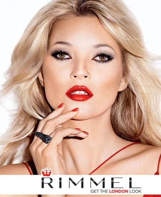
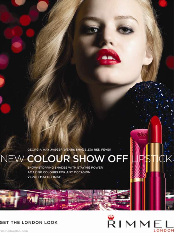
In each of the images the models have bright powerful red lips amplify power and importance. And to tie in with things that represent London such as , telephone boxes , buses and of course the Union Jack. 
Online this has the adverts on YouTube , posters on google and the rimmel website and if typed into Twitter a hashtag would come up. 
They also have an app that ties in with the brand. 


Rimmel is a British company with their headquarters in London hence why they focus on London and incorporate so many British themes into their campaigns. Even in the logo there is a crown over the R of Rimmel which I think signifies the importance and quality of the brand. And also the crown ties in with our royal family. 

Monday 30 October 2017

Technological convergence and Branding

Technological convergence is where we see technologies coming together and becoming more convenient for the customer , for example phones now being made with built in cameras and mp3 players.


Henry Jenkins has a Convergence Theory , he looks at Participatory Culture where we the users of the internet actually add information knows as user generated content , Web 2.0 in contrast to Web 1.0 has a lot more collective intelligence where we participate in the growing of information on the internet.


A brand is a type of product manufactured by a particular company under a particular name.


Brands could be movies , music artists , theme parks and could include a persona , or merchandise for that brand to build that brand , for example , although a family , the Kardashians are a worldwide brand as they have a tv show , personas , makeup lines and clothing lines.
Branding is very important as it can create more profit for the brand , how your brand is portrayed will decide the customers you attract and how many. A bad image would not be good at all for a brand as people would no longer be interested for example Ryanair is known to be unreliable therefore people are less likely to chose to fly with Ryanair for fear of the flight being cancelled.

Wednesday 18 October 2017

My Final Magazine Cover


This is my finished magazine front cover , I am very pleased with it and I feel it has lots of hip hop magazine conventions , I feel I have worked really hard on this by putting a lot of spare time into it to make sure it is exactly what I wanted and making sure it keeps to my flat plan which I think I did quite well, although I know there could be further improvements to make this more complex , such as airbrushing the model , I found this task really fun and now feel a lot more confident with my Photoshop skills and would hopefully be quicker on it in the future , I especially liked learning things outside of Photoshop also to benefit my magazine such as making the QR code.


Adding my model

I have put my model onto my layout and added layer to the image just to make the colors more vivid and the image have more shadowing , I have not chosen to Photoshop any part of his face or clothing to change anything as I am happy with the image as it is. I chose to pick this image as the camera is angled slightly lower to create the image of power but the and the model is looking seriously into the distance , I cropped the image from it being a mid shot to a mid close up as it is a common convention of hip hop magazines to use this shot.


Creating my QR code

For my front cover I created a QR code which links to the Power magazine website which I created , I think this added authenticity to my front cover and is a very modern touch. 
I created my website on Wix , where i had to choose a layout and create the page myself .

Once I had completed the webpage and it was online I went to a QR code making website and entered the web address so that it would create a custom QR code for me.

Once I had the QR code I added it to my magazine cover and tested it out.

My Layout

For my layout I have created something that has everything my flat plan wished it to, I have my large bold masthead which I chose to do in white and red as it is a common convention, along the right side of the page I have added in the features of the magazine, I used a red font with a black rectangular graphic behind each of them to make then stand out and also this is quite common to be used on front covers of magazines to help the font stand out from the background. I made sure that the black rectangles all had the same amount of space between the first and last letter of the text so that it looks neat and professional. Underneath the masthead I added a feature story to give insight I as to what is inside the magazine, for this I actually used a play on words, the artist the article is about is called “Notorious Biggie” often shortened to “Notorious B.I.G” and because his music was so widely respected in the hip hop community it is all of his notorious big hits that are listed in the article. As a common convention I added the artists name in the bottom left corner, for this I chose the color red as it signifies power and is a bright eye-catching color. As another convention I added a barcode but I also added a QR code which can be scanned and will link to a website I created for my magazine.


My Flat plan

This is my Flat plan , I hope to stick to it as best as possible for the layout and along the way make decisions as to color and fonts. I chose the bold font for my masthead because its a common convention for hip hop magazines and i chose the layout as it is also very common to have names of artists on the cover as features then the models name in the lower left corner.

My Masthead creation

When I started my magazine cover the first thing I did was my masthead , I used a font from photo shop and added effects and played with the width and length of the letters to create a font I felt was best and suited to my vision. I made sure I used capital letters as it’s very rare to see a magazine masthead without capital letters. As you can see here I added effects to the words to create a shadow and make the font appear more 3D against the red background I added.


I chose the name “power” for my magazine as hip hop music oozes power and money, hip hop artists images are based on power and every hip hop artist wants to be perceived as the most powerful, I also chose the name as it is a very popular Kanye West hip hop song, which some people who listen to him might realize.  I decided to make the font white with a red rectangular graphic behind as it is a common magazine convention to use red and white in the masthead especially in hip hop magazines. I placed the masthead in the far left corner as that is also a magazine convention.  


Model consent

Here is my model holding a consent form stating that I can use and publish videos and images I have taken of him.

My Model Shots

In these shots I was sure to use a range of angles and shot lengths in keeping with my shot list plan , I enjoyed using the professional camera to create these shots and found it a lot easier and simpler than I expected it to be.


Shot List


This is my shot list , I have described the angles and shot lengths i'm going to use in each shot.To create these images I used the online gaming account IMVU to take these print screens. I created my virtual character to wear what I would like my model to wear.

Rimmel “Get The London Look”

One of Rimmels marketing campaigns was “Get The London Look” where a British model was featured in a series of adverts for Rimmel. They u...